CSS and HTML Code
In this left-hand column will be all of the HTML and CSS code needed to output the Grid Photo projects and a small version of the project itself
Nine Boxes
This code goes in the <HEAD> section of your HTML
or it could go in your style sheet without the <style> tags
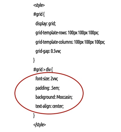
<style>
#grid {
display: grid;
grid-template-rows: 100px 100px 100px;
grid-template-columns: 100px 100px 100px;
grid-gap: 0.5vw;
}
#grid > div {
font-size: 2vw;
padding: .5em;
background: Moccasin;
text-align: center;
}
</style>
This is the HTML code for this example
This goes in the <BODY> section
<div id="grid">
<div>1</div>
<div>2</div>
<div>3</div>
<div>4</div>
<div>5</div>
<div>6</div>
<div>7</div>
<div>8</div>
<div>9</div>
</div>
Images Spilling Out of Their Containers
Nine Boxes of Photos
Shadow Box
Css gid layouts
Let's start with a simple example
This first grid layout is about as simple as any we could make but still it looks really very nice so let's give this nice looking layout a name and call it Nine Boxes
If you'll look just to the left of this text (or below this text on a small screen device) you'll see the CSS for this layout
So let's go through this CSS code line by line
First of all the style tag <style> which you should use if you are going to place this code in the head section of your webpage however you would NOT use the style tag if you are going to put this code into your MyPage.css style sheet
#grid{ tells the browser id will be the identifier we'll be using and sure enough if you look at the html below you'll see <div id="grid">
dispay:grid; tells the browser that the element we'll be defining with this id will be a Grid Container
grid-template-rows: 100px 100px 100px; and grid-template-columns: 100px 100px 100px tell the browser that we want the "children" of the parent grid container to be 3 rows and 3 columns of 100px by 100px grid items
If we had stated fr fr fr instead of 100px 100px 100px we would have had boxes or grid items of equal width stretching as far as page would allow
The fr statement stands for fraction and in CSS Grid Layout represents a fraction of the available space in the grid container but in this case we didn't want our grid to stretch to cover all the available space we just asked for nine 100px boxes
grid-gap: 0.5vw; define the dimension of the spaces between the grid items an vw stands for "viewport width" and is a unit of measurement used for defining sizes relative to the browser's viewport which means the user's visible area of a webpage
#grid > div{ tells the browser that we are now referring to the children of the parent container
font-size: 2vw; here the size of the text will be defined proportional to the users page whether it's a phone, tablet or huge desktop screen and we could have specified pixels but vw is the wiser choice here
padding: .5em; em is a value relative to the font size of its parent element in our case the nine grid items and padding is space inside our grid item or box's border
background: Moccasin; choose any color you want but make sure it is a safe HTML Color Name that will be recognized by all browsers
text-align: center; and we just want the text centered in the grid item
And then just below the CSS is the HTML code
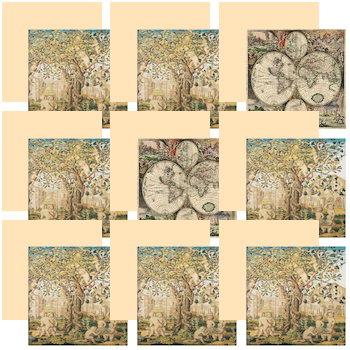
You might be wondering what would happen if I were to replace the numbers inside the grid items with images
Well you could certainly do that simply by replacing the numbers in the HTML code with links to images with code like this: <img src="SomePhoto.jpg" alt=""> and they would load but they would spill out of their containers because there isn't room for them since there is something already there in your CSS styling
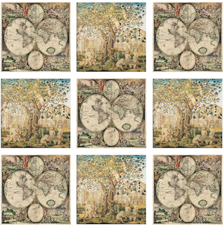
If you were to create a different style sheet for the head section of your page or for the .css file you are linking to in your page's head section that looks like this:
<style>
.grid {
display: grid;
grid-template-rows: 100px 100px 100px;
grid-template-columns: 100px 100px 100px;
grid-gap: 0.5vw;
}
.grid > div {
}
</style>
And then started your HTML code with: <div class="grid">instead of <div id="grid"> then you would end up with a beautiful CSS Grid Layout of photos like the one just to the left of this text
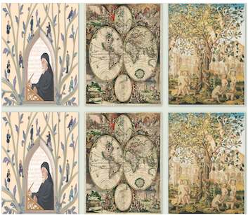
Shadow Box
How about something more complex like a grid photo layout with shading added around some of the borders
Here's an explanation of the CSS code for this grid photo layout
.grid { this defines our grid layout as a class <div class="grid">
display: grid; says we want a block element grid layout rather than an inline grid
grid-template-columns: repeat(auto-fill, minmax(200px, 1fr));
auto-fill: Tells the browser to generate as many columns as can fit in the container without overflowing
minmax(200px, 1fr) 200px: The minimum width for a column
1fr The maximum width, meaning it takes one fraction of the available space, distributing it equally among columns
.grid img { Tells the browser that we are now referring to grid items rather than the whole grid
border: 1px solid #ccc; Calls for a 1 pixel border around all grid items that is colored grey
box-shadow: 2px 2px 6px 0px rgba(0,0,0,0.3); Tells the browser to create a box shadow aound each grid item
2px 2px 6px 0px The first value calls for a 2 pixel horizontal shadow the next value specifies a vertical shadow and the next value defines a 6-pixel blur radius for the shadow, making its edges appear diffused and a higher value would result in a more blurred shadow while the last value value specifies a 0-pixel spread radius meaning the shadow will have the same size as the element, without expanding or contracting
rgba(0,0,0,0.3) The rgba(0,0,0,0.3) asked for a semi-transparent black shadow
rgb(0,0,0): This part defines the color as black, where Red, Green, and Blue are all set to 0
0.3: is the alpha channel value, which determines the opacity of the color ranging from 0 (fully transparent) to 1 (fully opaque) so in this case, 0.3 means the color is 30% opaque and 70% transparent